6 Things to be Considered Before Designing Effective Safety Sign Boards
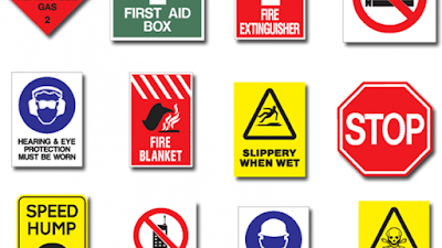
A safety sign can be defined as communicating the necessary instructions through symbols on signboards or small pasted boards at the workplace or another place. These signs can be considered as non-verbal communication to impart important information.

These signs should be effectively designed in proper colors and be placed at prominent places. The information needs to be precise without any fail!!
Below are some important points that need to be taken care of while designing a signboard that is readable and visible.
1.Font Style: One of the key aspects of designing a signboard is the font style. A signboard should always be in BOLD letters, irrespective of the purpose. Avoid using creative, or cursive writings in choosing the font style. The most important information or the main purpose should be placed in maximum size after that you can include information that is less important in smaller font.
2.Composition: Avoid overstuffing your board with a lot of content on it. The information on the signboard needs to be precise and direct. Most of the signboards are useful in emergency situations hence needs to be short and to the point.
You can also include some safety signs or symbols to depict the situation in a more appropriate manner. Using popular symbols of NO PARKING, WAY TO STAIRCASE can be used easily to avoid writing in full-text format.
3.Color: Color combination is very important for designing a signboard. The colors like RED and YELLOW have short wavelengths and hence are visible from a distance. Emergency signboards should be printed in these colors so that these are visible in smoke or low-visibility situations. Also, try to have a white background or light background accompanied by contrasting colors of the font. If you are having safety boards on illuminated boards, bright colors should be used.
4.Placement: These boards should be placed in prominent places. Having a board behind the wall is of no use. The safety signs should be visible to all so that when anyone passes through it, subconsciously he should know the rules.
These boards should be placed at a readable height to make out the best use of them.
These boards should be placed at a readable height to make out the best use of them.
5. Size: These signs are available in standard sizes approved by ISO, you can opt to choose a signboard of customized height and width depending upon the usage. But a board should be of such size that it should be clearly visible and taken seriously. Also, oversized safety boards with lots of content should be avoided.
6.Material: These safety signs can be printed on a variety of materials, such as Aluminium, Foam, Vinyl, Plastic, etc. Colors of the font should be chosen, depending upon the material of the board. By using digital printing services these signs can be printed in glossy colors making the boards visible from a distance. These are also available in laminated or without lamination, one can choose as per their needs.
Also, there are many digital printers who can provide standard size safety boards on demand. If you don't want to invest time in designing one, you can choose to avail a standard one!!


Comments
Post a Comment